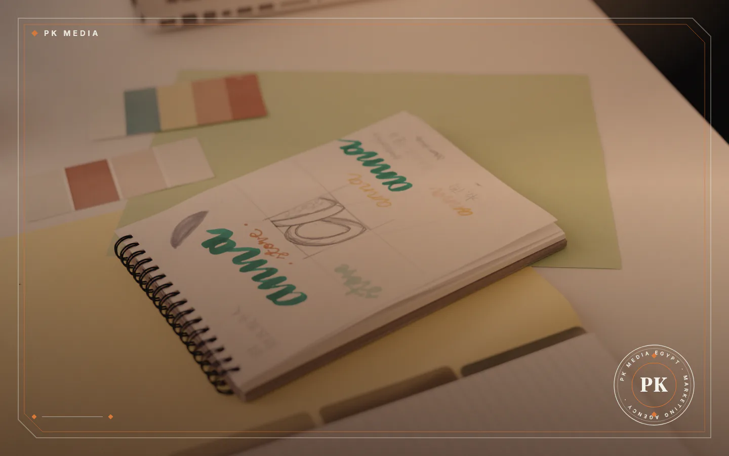
A logo is one mark, and a brand identity is the set of rules around it. See what each does, a worked example, a test checklist and common mistakes.
A logo is one mark that identifies a business, while a brand identity is the whole system of visual and verbal rules around that mark. In the brand identity vs logo question, the logo is one part of the identity and not a replacement for it. The logo tells people who you are at a glance, and the identity tells everyone who makes material for you how to keep it looking and sounding like you.
Brand identity vs logo: the difference in practice
Think of a logo as a signature and a brand identity as the handwriting, the stationery and the manner that go with it. The signature is useful alone, but it does not say which paper to use or how to write the letter. For a business owner, the difference shows up on the day a second person starts making your material.
A designer preparing a menu, a printer producing packaging and a colleague posting on social media all need the same answers: which colour, which font, how much space around the mark and what tone the writing takes. A logo file answers none of these, while an identity answers all of them in one place. The full definition of the term and its parts is in our article on what a visual identity is and what it includes.
What a logo does well
A logo is the symbol, wordmark or combination of the two that people use to recognise you. It sits on your sign, your packaging, your website header and your social profiles. A good one stays readable when it is very small, such as a profile picture, and when it is very large, such as a shop front.
A logo also has limits. It does not choose the colours of a printed poster, does not say how headings and body text are set and does not decide whether your captions sound formal or friendly. Those decisions get made anyway, one piece of material at a time, and without a shared rulebook they drift apart.
What a brand identity adds around the logo
In practice an identity is delivered as a set of parts that work together. This is the usual content, and a given project may include more or fewer parts depending on the business:
- Logo versions: horizontal, stacked and icon-only, in full colour and in one colour, so the mark works on any background.
- Colour palette: main and supporting colours, with a note on where each one is used.
- Typography: the typefaces for headings and body text, with a matching choice for each script the business writes in.
- Imagery style: the kind of photography, illustration and lighting that suits the brand.
- Graphic elements: icons, patterns and shapes that make material recognisable even without the logo.
- Layout rules: spacing, margins and the clear space left around the logo.
- Tone of voice: how the business writes and speaks, for example formal, friendly or direct.
- Brand guidelines: one document that gathers the other parts for anyone who produces material.
The page for PK Media's brand identity service describes the same core: logo, colour palette and typefaces, then their use on social media, print and packaging, and video and motion graphics. The identity also shows up on social media profiles, covers and posts.
A bakery opens a second branch: logo alone or full identity
Take an imaginary bakery that opens a second branch and starts selling through social media. Its owner has a logo and nothing else. The first branch's sign uses one shade of brown, the printer for the new branch picks another, and the social posts use whichever font the person posting prefers that week.
Within a few months the same bakery appears in three different looks. A customer who sees the sign, the box and the post may not realise they belong together. This is an invented example, not a client story, and it carries no measured result.
With an identity, the sign maker, the printer and the person posting all work from the same palette, typefaces and layout rules. The logo still does its job, and everything around it now matches. In our judgement, agreeing these rules is a cost paid once, while correcting mismatched material is a cost that returns with every new piece.
Logo, brand identity, brand and trademark are not the same thing
Four words get mixed up. The logo is the mark, and the brand identity is the system around it. A trademark is a legal category: the World Intellectual Property Organization (WIPO) defines it as a sign that can distinguish one enterprise's goods or services from another's, and says protection can be obtained through registration with a national or regional trademark office.
A logo can be a trademark, but designing a logo is not registering it. Whether to register, and where, is a legal question for the trademark office of the country where you trade or for a qualified adviser, and this is not legal advice.
The brand itself is the overall impression people hold of your business, shaped by what you sell, how you treat customers and what you say. A plan for audience and message comes before the design, and our marketing strategy page covers that side of the work.
When a logo alone is enough, and when it is not
A logo alone can be a sensible start for a very early idea, a short project or a test of a business concept. The need for an identity appears when you publish on several channels, print material or hand work to more than one designer or supplier.
These signs suggest the logo has stopped being enough:
- Two pieces of your material look as if they come from different businesses.
- Each new designer asks which colours and fonts to use, and the answer is "the ones on the last file".
- Your logo looks wrong on a dark background, in a small social avatar or in a one-colour print.
- Your captions and replies change tone depending on who is posting.
Any one of these is a reason to write the rules down. None of them means you must rebuild everything.

How to test a logo and an identity before you approve them
Check the work in real situations, not on a presentation slide. Go through this list with the designer:
- Shrink the logo to the size of a social media profile picture and check that it is still readable.
- Place it on white, on a dark colour and on a photograph, and check that a version exists for each case.
- Print it in one colour, as a stamp or a receipt would, and check that it still works.
- Write a heading and a paragraph in the chosen typefaces in every script your business uses, and check that they look balanced together.
- Check text colours against their backgrounds. WCAG asks for a contrast ratio of at least 4.5:1 for normal text and 3:1 for large text; text that is part of a logo is exempt, but the other text on your website is not.
- Ask for the guidelines document and check that someone outside the project could follow it.
If your website marks up its logo for Google, the image must be at least 112 by 112 pixels and sit at a crawlable, indexable address, and Google suggests checking how it looks on a plain white background, so keep a version that works on white.
If the business publishes in Arabic, test the layout rules on a right-to-left page too; W3C advises setting the base direction of a page with the dir attribute in HTML.
Common mistakes when ordering a logo or an identity
Watch for these mistakes before you order:
- Buying only a logo and calling it branding: without colours, typefaces and rules, every later decision has no reference.
- Accepting one logo file: a single file in one format may fail on dark backgrounds and at small sizes.
- Copying the look of a competitor: it can make your business harder to tell apart instead of easier.
- Choosing by taste alone: decide first who will see the material and where, then pick the colours.
- Skipping the guidelines: rules that live only in the designer's head may leave with the designer.
- Assuming a design is a registered trademark: registration is a separate legal step.
We offer brand identity design at PK Media, so we have an interest in this topic. These checks fit any provider: ask what you will receive, in which files, whether guidelines are included and who holds the final files. A wider comparison of providers is in our guide to choosing a branding agency in Egypt.
Frequently asked questions
Is a logo the same as a brand?
No. A logo is one mark, while the brand is the overall impression people hold of your business.
Does a small business need brand guidelines?
Often yes, once more than one person produces material. In our view the document can be short, as long as it settles colours, typefaces, logo use and tone.
Do I have to register my logo as a trademark?
Design and registration are separate steps. Ask the trademark office of the country where you trade, or a qualified adviser, whether registering your mark suits your case.
Can I update my identity without starting over?
Yes. A refresh can keep the elements that already work and change those that do not, depending on how well your current identity serves the business.
Where to begin this week
Start with three things that need no designer: write two sentences about who your customers are and what you offer them, collect every version of your logo, colours and fonts now in use, and mark the places where they disagree. Then bring those notes to your designer.
If you want help turning the notes into an identity, contact PK Media with a short description of your business.
Sources
- WIPO, read 19 November 2026
- Google Search Central, read 19 November 2026
- W3C Web Accessibility Initiative, read 19 November 2026
- W3C Internationalization, read 19 November 2026
- Brand Identity
- Logo Design