A visual identity is the logo, colours, typefaces, images and rules that make a business recognisable. See its parts, where it appears and how to review the one you have.
A visual identity is the set of visual choices that makes a business recognisable: its logo, colours, typefaces, image style, graphic elements and the rules for using them together. A business with a clear visual identity looks the same on a shop sign, an invoice and a social media post, so people can recognise it more easily. The difference between an identity and a logo has its own article on brand identity vs logo.
What a visual identity is made of
An identity is built from parts that are designed to work as one system:
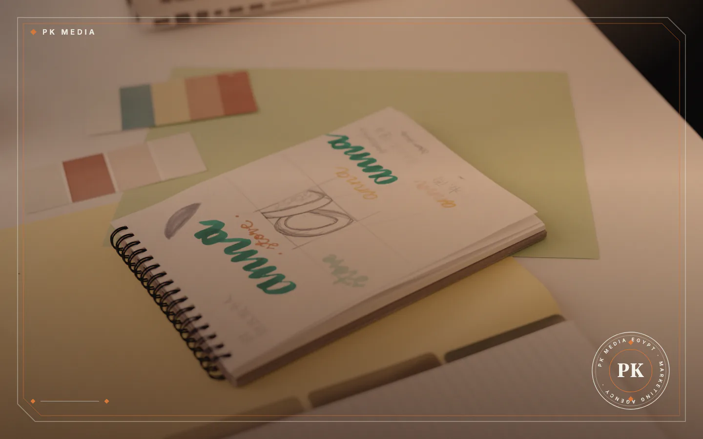
- Logo set: the main logo, horizontal, stacked and icon-only versions, and one-colour versions for light and dark backgrounds.
- Colour palette: main and supporting colours, plus neutrals for text and backgrounds, each with exact values.
- Typefaces: one for headings and one for body text, each covering the scripts the business writes in.
- Image style: the light, angles, subjects and tones that photos and videos use.
- Graphic elements: icons, patterns and shapes that add a recognisable character.
- Layout rules: the space around the logo and where headings and text sit in print and on screen.
- Naming and tone of voice: the business name, its tagline and the way its texts are written, formal or friendly.
- Guidelines document: a file that gathers these rules for everyone who designs or writes for the business.
The parts depend on each other. A palette with no rule for text colour, or a logo with no small-size version, leaves gaps that each new designer fills differently, and the identity can drift apart.
Colour: a palette people can read
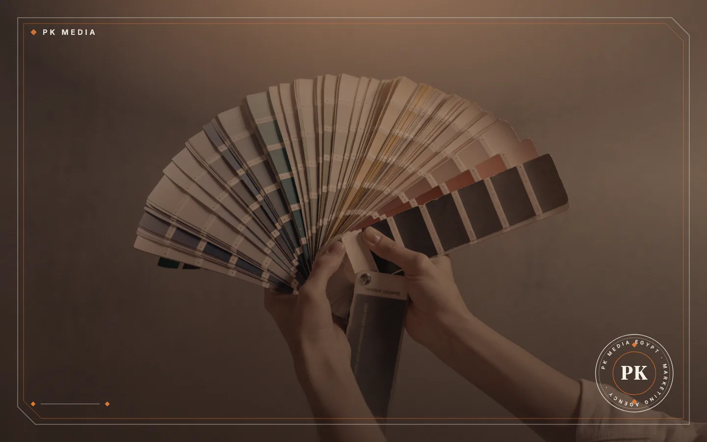
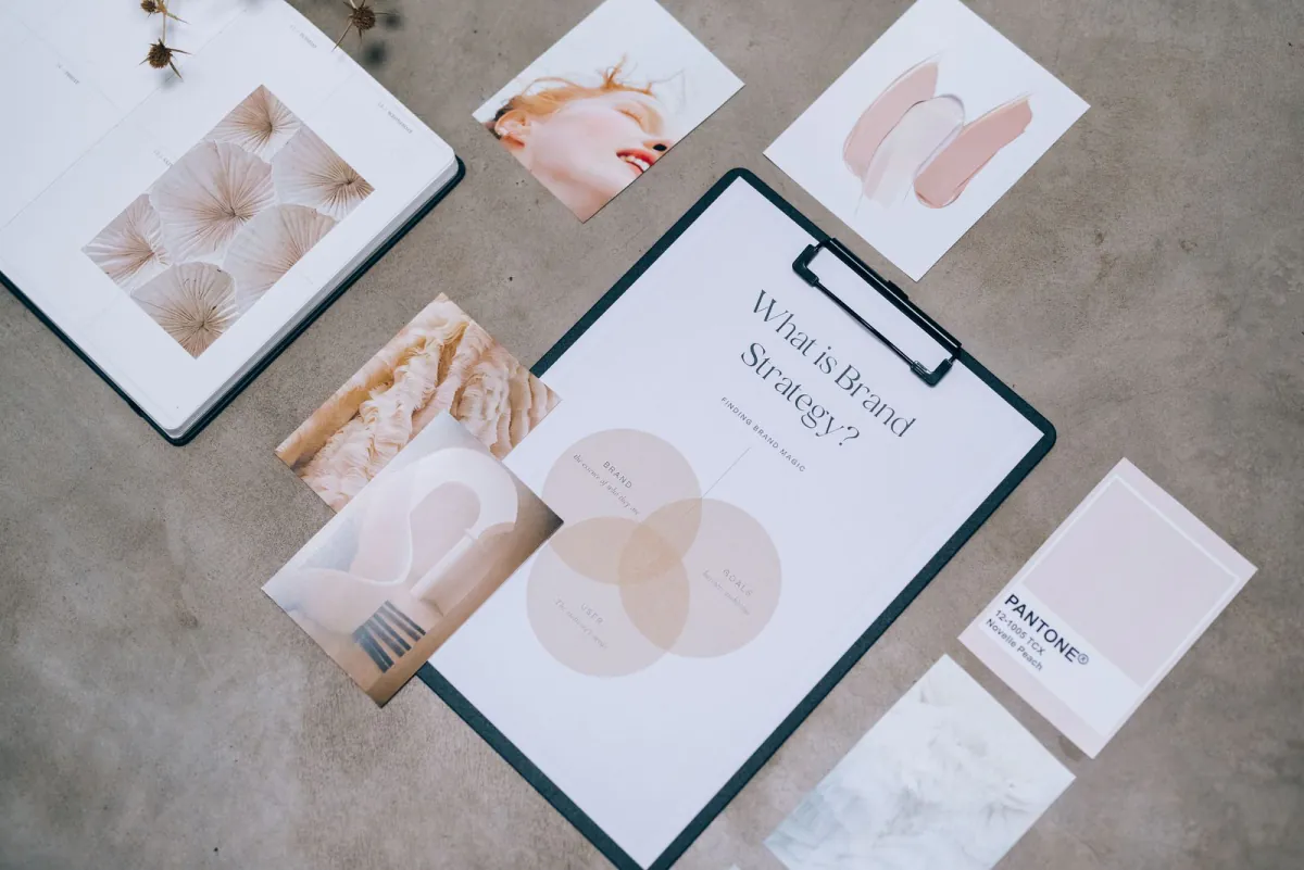
A palette is not a list of favourite colours. It is made of main colours, supporting colours and neutrals for text and backgrounds, and each colour has exact values so that print and screen match as closely as the material allows.
Readability decides which pairs are allowed. The W3C's Web Content Accessibility Guidelines ask for a contrast ratio of at least 4.5:1 between normal text and its background, and at least 3:1 for large text, with some listed exceptions. If the identity will be used on a website, check every text and background pair in the palette against those ratios before approving it.
The same guidelines say colour should not be the only visual means of conveying information. In practice, a red price tag or a green "available" label should also carry a word or an icon, and the identity rules should say so.
Typefaces, photos and graphic elements
Typefaces carry personality too. Pick one for headings and one for body text, and make sure both cover the scripts you use. A business that writes in Arabic and English should test the Arabic and Latin faces side by side at the same size, because a pair that looks balanced in a large heading may look uneven inside a paragraph. This is practical advice, not a rule.
Image style is a set of decisions: natural or studio light, close or wide framing, people or objects, bright or muted tones. Written down with two or three example photos, it lets a new photographer or social media editor choose pictures that belong.
Graphic elements such as icons, patterns and shapes add recognisability when they are few and used on purpose. A small set applied the same way everywhere is easier to keep consistent than a large set that changes with every post.
Where an identity appears in daily use
An identity is judged at the points where customers meet it:
- Printed material: business cards, letterheads, brochures and menus.
- Packaging and labels: boxes, bags and stickers on products.
- Signs: the shop sign, vehicle graphics and window displays.
- Social media: profile pictures, covers and post templates.
- Website and app: headers, buttons, forms and the small browser icon.
- Documents: invoices, quotations and presentations.
On social media a profile picture is tiny. The icon version of the logo needs testing at that size, and so does the favicon, the small image that can appear beside a site name in Google Search results. Google advises that a favicon be visually representative of the site's brand and square, and recommends one larger than 48 by 48 pixels. Templates for a brand's social media accounts are reused again and again, so they are worth getting right.
Finished creative projects are collected in our portfolio.
Why a visual identity matters to a small business
A consistent identity does four jobs for a business that has no large marketing team:
- Recognition: a customer who has seen your colours and logo once can spot them again on a shelf, in a feed or on a sign.
- Consistency: material made by different people on different days still looks like it comes from one business.
- Faster production: with templates and rules, a new post, flyer or quotation does not start from a blank page.
- Clearer decisions: the team can check a draft against the rules instead of arguing over taste.
None of this promises more sales. An identity makes a business easier to recognise and easier to work for, and the offer still has to be good. It helps when it follows a decision about who you serve and what you promise, which is the job of a marketing strategy.
A checklist for reviewing the identity you already have
A business that has traded for a while may have an identity by accident. Review it step by step:
- Gather everything customers see: cards, signs, social profiles, invoices, the website and packaging.
- Lay the items side by side and note where the logo, colours and typefaces differ.
- Decide which version of each element stays and which is retired.
- Test the logo at small size and on light and dark backgrounds, and check text and background colours against the WCAG contrast ratios.
- Write down the missing rules: colour values, typeface names and sizes, space around the logo and image style.
- Rebuild the templates that matter most, for example social posts, the invoice and the quotation.
The result is a guidelines document, even if it starts as two pages. A short guide that is kept up to date is more useful than a long one that is not.
Common mistakes, and when a full identity is too much
These mistakes are easy to make when building or refreshing an identity:
- Copying a competitor's look, which makes the two businesses harder to tell apart.
- Using too many colours or typefaces, so they are harder to remember.
- Designing for the screen only, then finding that the logo fails on a stamp, a sign or a pack.
- Accepting final files with no editable version and no colour and typeface details, which ties the business to the first designer.
- Redesigning at every doubt, which can throw away the recognition the earlier look built.
A full identity is also not necessarily the first thing to buy. Take a hypothetical stationery shop opening its first branch: a logo set, two colours, one pair of typefaces and a one-page rulebook are enough to start, and the shop can add image style and pattern work once it has a website and regular social posts. The example is illustrative, not a client case.
Frequently asked questions
Can a small business create its own visual identity?
Yes. A business can start with a simple set: a logo in a few versions, two or three colours, two typefaces and a page of rules. One risk is inconsistency, so write each rule down as you choose it. A designer can help when the identity must work across print, packaging and a website.
Can a visual identity be registered as a trademark?
Parts of it may be. WIPO describes a trademark as a sign capable of distinguishing the goods or services of one enterprise from those of others, and says it can consist of words, drawings, symbols or colour shades used as distinguishing features. Whether your logo or colours qualify, and how to register in Egypt, is a question for the competent authority or a trademark lawyer.
How often should a visual identity change?
There is no fixed schedule. Small updates, such as new templates or a refreshed photo style, are normal. A full redesign can change how recognisable the business is, so it needs a reason, such as a new audience, a new service or materials that no longer match.
What should I receive when an identity project ends?
What is handed over varies between providers, so ask for a written list before work starts. A useful list includes the logo files in every version, editable source files, the colour values, the typeface names and licences, the guidelines document and the key templates.
Next step: list what is missing
Start with the review checklist and note where your materials disagree. If you want help closing the gaps, PK Media offers brand identity design as one of its services. Whoever you choose, ask for a written list of what will be handed over, and see how to choose a branding agency in Egypt for questions that apply to any provider.
To talk through your own materials, contact PK Media and describe your business, your audience and what you already use.
Sources
- W3C Web Accessibility Initiative, read 19 November 2026
- W3C Web Accessibility Initiative, read 19 November 2026
- Google Search Central, read 19 November 2026
- WIPO, read 19 November 2026
- Brand Identity
- Logo Design